Agile Charts
Quickly visualize and monitor a project’s status and progress with Agile diagrams
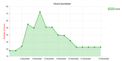
Burn-down Chart
Depending on your needs Burn-down chart can be applied for Issues, Time Spent and Story Points. The chart is a graphical representation of amount of work left to do versus time.
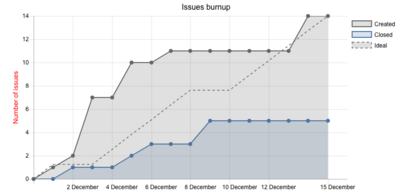
Burn-up Chart
Works as burn-down chart with the only difference that instead of tracking how much work is left to be done, it shows how much work you’ve completed. As well, can be applied for Issues, Time Spent and Story Points.
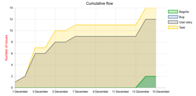
Cumulative Flow Diagram
It can be applied for particular project or all trackers. The Cumulative Flow Diagram shows the way the tasks builds up and their distribution along the different process stages. It gathers tasks in different columns. One color per column - each band tells you how many tasks sits in what stage of the process in a given time (the horizontal value). It can be very useful to use CFD for your workflow
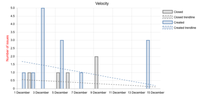
Velocity Chart
A velocity chart shows the sum of estimates of the work to be done (accepted Story Points) delivered across all iterations, the past and the current one. It allows you to predict the amount of work your team can get done in future sprints. Great for sprint planning meeting.
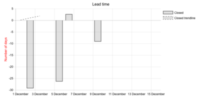
Lead Time Chart
Lead time represents the time taken from the moment when an issue is created until its completion.