The RedmineUP logo is the most immediate representation of our company, our culture and our brand and should be used consistently in the proper, approved forms. These guidelines will help you determine the best way to use it.
![]()
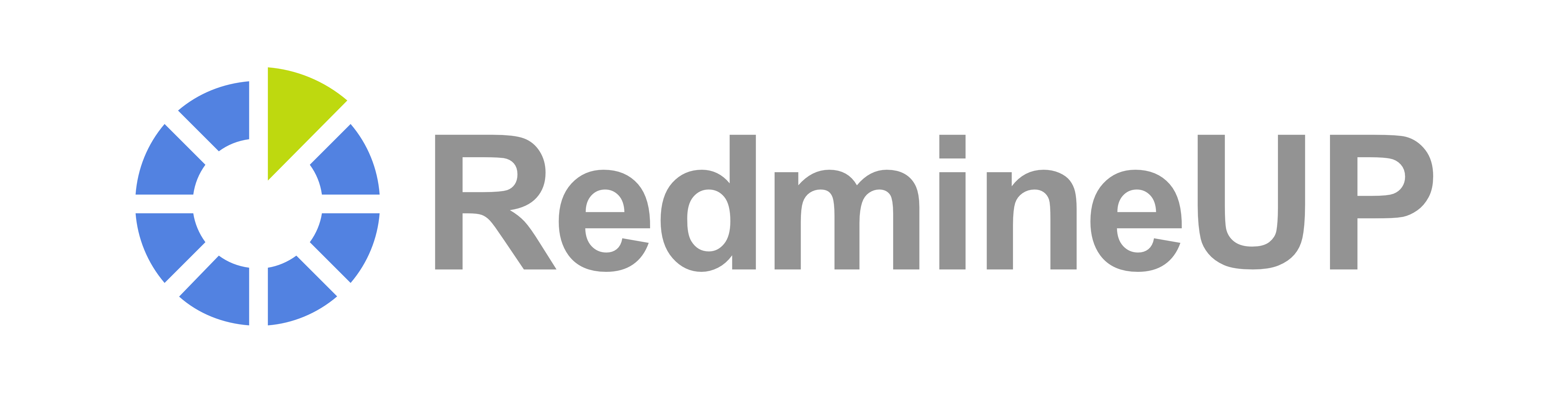
The Logo
Use the full logo whenever possible.
| |
|
| 2-COLOR, WHITE BACKGROUND | WHITE, DARK BACKGROUNDS |
| EPS, PNG, SVG | EPS, PNG, SVG |
The Mark
The RedmineUP mark should only be used in cases where a company icon or avatar is required (traditionally constrained to a perfect square or circle). In all other cases, use the logo.
Square Icon
 |
 |
| COLOR SQUARE ICON | WHITE SQUARE ICON |
| EPS, PNG, SVG | EPS, PNG, SVG |
Circle Icon
 |
 |
| COLOR ROUND ICON | WHITE ROUND ICON |
| EPS, PNG, SVG | EPS, PNG, SVG |
Spacing
The logo must always be surrounded by open space, free from any other element. The minimum spacing is equivalent to the height of the capital “U” in RedmineUP on all four sides.
![]()
Do not change the spacing or colors, add embellishments or drop shadows, or place the logo over intricate or elaborate backgrounds.