- Work Burndown
- Issues Burndown
- Cumulative flow
- Tracker Cumulative flow
- Velocity
- Lead time
- Issues burnup
- Trend Lines
Work Burndown
Tracks: Estimated number of hours (effort) remaining to complete the goal.
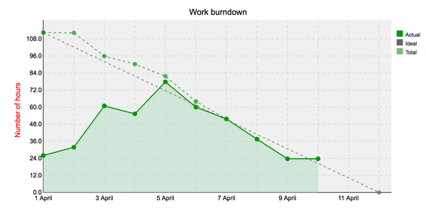
The work burndown chart provides you with the following information:
- Actual Completed (solid line) — The number of estimated hours remaining until the due date. These values are calculated as all issues "Estimated hours" x "Done ration" present in that day. Chart use issue journals to track changes by dates and can't be changed behindhand.
- Total Completed (dashed line) - The number of total estimated hours remaining until the due date ignores issue creation and start date. This line used for creating the Ideal burndown line to calculate correct burndown velocity.
- Ideal (grey dashed line) — The ideal burndown. This is computed with the remaining estimated units at the version's start date. Hence, this calculation makes the guideline slope more accurate and precise. Ideal burndown based on Total cumulative hours burndown.
Issues Burndown
Tracks: Estimated number of open issues (effort) remaining to complete the goal. It shows how quickly the team is burning through user stories.
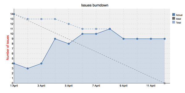
The issues burndown chart provides you with the following information:
- Actual Completed (dark solid line) — The number of issues remaining until the due date.
- Total Completed (light dashed line) - The number of total issues remaining until the due date. It sums all the user stories per sprint.
- Ideal (grey dashed line) — The ideal burndown - works as a guide for a team. It means the team is not over-committing and finished the spring backlog on time. Also, it indicates no problems with capacity estimation. Such burndown is computed by calculating the exact amount of effort remaining which team needs to burn down.
Cumulative flow
Tracks: Efficiency through stages in the delivery process
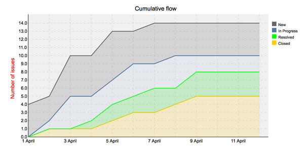
The cumulative flow chart shows how many issues are currently in each of the statuses. Probably the most important is the In progress part. If it increases or widens vertically with time, it means that there are some problems or bottlenecks along the way. This indicates delays in the project. A large increase in resolved stories may also indicate a bottleneck on the testing or acceptance stage.
Tracker Cumulative flow
![]()
Tracker Cumulative flow chart shows how many issues there are over time in different trackers: tasks, user stories, bugs, and features. It takes into consideration also closed issues.
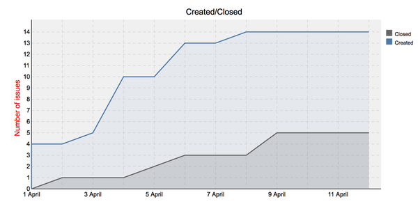
Velocity
The velocity chart shows how many issues were created and closed over time.
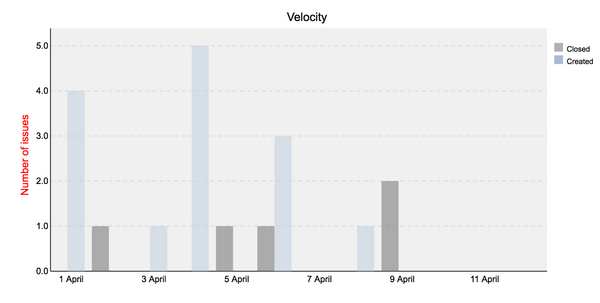
It provides you with the following information:
- Closed - The number of issues closed.
- Created - The number of issues created.
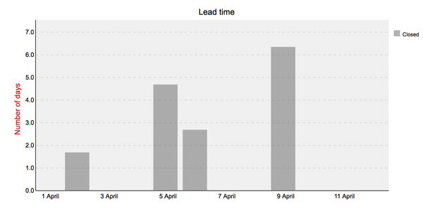
Lead time
Tracks: How long an issues cycle takes from creating to closing in days. The charts show closed issues over time, and if there are several closed issues on a certain day - average lead time. Lead time for each issue is displayed only if the issue has been closed.
Issues burnup
Tracks: progress towards project completion.
It provides you with the following information:
- Closed - The number of issues closed.
- Created - The number of issues created.
- Ideal - Ideal burnup, works as a guideline for the team.
The project will be completed when the lines meet. This is a very powerful tool helping to understand how close the team is to the completion of the project, and similarly to burndown charts, it can also notify about any bottlenecks, e.g. when there are too many new issues comparing to issues closed.
Trend Lines
- Closed Trend Line: The closed trend line represents the average number of issues that are closed over a specific period of time. It shows the trend of how the number of closed issues changes over time. The line is calculated by grouping the closed issues by the specified time period (e.g., week, month) and calculating the average number of closed issues in each period.
- Created Trend Line: The created trend line represents the average number of issues that are created over a specific period of time. It shows the trend of how the number of created issues changes over time. The line is calculated by grouping the created issues by the specified time period and calculating the average number of created issues in each period.
- Grey-colored Area: The grey-colored area represents the standard deviation of the lead time values. It indicates the variability or dispersion of lead time data points around the moving average line. The wider the grey area, the higher the variability in lead time.
- Moving Trend Line: The moving trend line represents the moving average of lead time values. It smoothes out the fluctuations in lead time by calculating the average of a subset of lead time values over a specified number of periods. The moving average helps identify the general trend of lead time over time.