This article explains the tabs of the Helpdesk Widget panel, how to style it and what visitors can do in the form. To turn the Widget on and add it to a page, start with that article.
The Widget is isolated from the page it sits on: it lives in its own shadow DOM, so your site's CSS and scripts cannot break it, and it cannot break them. The page loads one small cached script; the form loads only when a visitor points at the button.
Tabs
The panel can have three tabs. A tab is shown only when it has something to show, and the first one present opens by default. The last tab a visitor used is remembered for the session.
| Tab | What it does | Needs |
|---|---|---|
| Articles | A searchable list of help articles; a click opens the full formatted article in the same panel. | Articles turned on and at least one article in the list |
| Ask AI | The visitor types a question and gets a short answer built from your documentation. | The Redmine Agent plugin with an active connection, see Ask AI |
| Contact us | The ticket form. | Nothing else. |
When only Contact us is available the Widget looks like a plain form, as before. 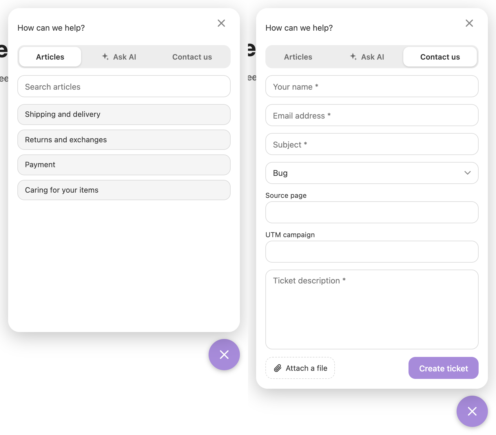
You can hide a tab on a given page from the data layer.
Look of the Widget
- Header text: a text at the top of the form, written in Textile or Markdown as in the rest of Redmine. A
titlepushed from the page replaces it. - Privacy policy checkbox: when Add privacy policy checkbox is on, the visitor must accept it before a ticket is created or an AI question is sent. The text accepts wiki markup, so it can link to your policy.
- Style classes: pick one value per group; changes reach pages within 5 minutes.
| Group | Classes |
|---|---|
| Theme | dark-theme (the default is light) |
| Corners | rounded-none, rounded-small, rounded-large |
| Accent colour | button-blue, button-red, button-green, button-yellow, button-lilac, button-purple, button-black (the default is grey) |
| Shadow | shadow-none, shadow-small, shadow-large |
| Fields | fields-small, fields-large |
| Submit button side | button-left, button-right |
The Widget also follows the dark mode of the visitor's system. A page can force a theme with theme: 'light' or theme: 'dark', add classes with classes, set an exact accent with color (it wins over a button-* class), and change the position with position (topLeft, topRight, bottomLeft, bottomRight).
What visitors can do in the form
- Attach a file with the paperclip button, by dragging it onto the panel, or by pasting a screenshot. One file per ticket.
- Come back later: after a successful submit the Widget remembers the visitor's name and email in the browser and fills them in next time. Push
remember: falseto turn this off. - See a clear list of errors if something is missing.
Tickets from the Widget are always created by the anonymous user; the contact is found or created by the email, as for incoming mail. A value your page sends is a hint: the server checks the project, the tracker and the allowed fields again.